Positioning
With positioning you can change the location of HTML elements within the visual viewport of the document.
Positioned elements are important to create complex layouts.
Static
  .css-selector {
    position: static;
  }
This is the default value for position property, it basically means it’s not positioned.
Relative:
.css-selector {
  left: 20px;
  position: relative;
  top: -20px;
  width: 500px;
}
Relatively positioned elements are offset a given amount from their normal position within the document. The top and bottom properties specify the vertical offset from its normal position; the left and right properties specify the horizontal offset.
Absolute:
An element that is absolutely positioned is taken out of the flow. It behaves like fixed except relative to the nearest positioned ancestor instead of relative to the viewport. The top, right, bottom, and left properties specify offsets from the edges of the element’s containing block.
.css-selector-relative {
  height: 400px;
  position: relative;
  width: 600px;
}
.css-selector-absolute {
  height: 200px;
  position: absolute;
  right: 0;
  top: 120px;
  width: 300px;
}
Fixed:
Fixed positioning is similar to absolute positioning, with the exception that the element’s containing block is the viewport. The top, right, bottom, and left properties specify offsets from the edges of the viewport’s block.
.css-selector-fixed {
  bottom: 0;
  position: fixed;
  right: 0;
  width: 200px;
}
Sticky:
Sticky positioning can be thought of as a hybrid of relative and fixed positioning. A stickily positioned element is treated as relatively positioned until it crosses a specified threshold, at which point it is treated as fixed until it reaches the boundary of its parent.
.css-selector-sticky {
  position: sticky;
  top: 60px;
  width: 200px;
}
Normal Flow
Elements on a webpage lay out in the normal flow, if you have not applied any CSS to change the way they behave. And, as we began to discover, you can change how elements behave either by adjusting their position in that normal flow, or removing them from it altogether.
First of all, individual element boxes are laid out by taking the elements’ content, then adding any padding, border and margin around them — it’s that box model thing again, which we’ve looked at earlier.
By default, a block level element’s content is 100% of the width of its parent element, and as tall as its content. Inline elements are as tall as their content, and as wide as their content. You can’t set width or height on inline elements — they just sit inside the content of block level elements. If you want to control the size of an inline element in this manner, you need to set it to behave like a block level element with display: block; (or even,display: inline-block; which mixes characteristics from both.)
Exercise
- create a new branch from master called
feature/positioning. - Go to
2-positioningfolder and create a file namedpositioning.html. - Create a file named
styles.css. - Inside the CSS file, create this layout using CSS positioning:
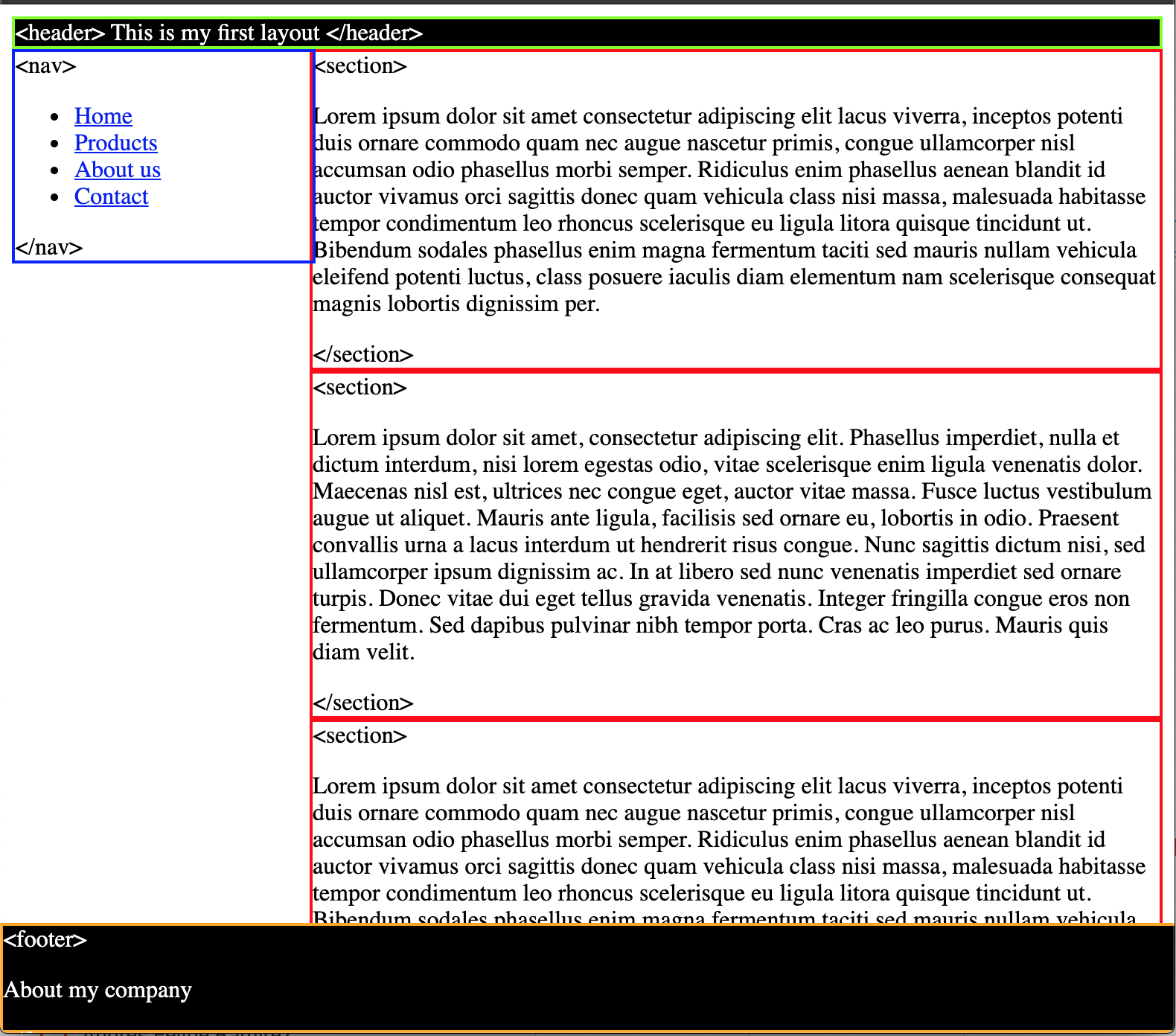
<header>sticky, green borders and black background.<nav>absolute, blue borders and 200px of width.<section>static, red border and it’s 200px away from its left.<footer>fixed, orange border and it’s fixed to the bottom.
What do you need to make the footer full width and visible? Resize your window and double check the responsiveness of your layout.
- Push your changes and create a new PR with your code.